prompt topic
Claude UI component prompts
Answer in brief
A Claude prompt for one component should fence the work in: one file, the props, every state by name, and a demo page where all the states sit side by side. Claude Code can see the whole project, and without a fence it will tidy things nearby that you did not ask about.
Tell it to read the project's tokens first and to ask when a value is missing. A component that brings its own colours and spacing looks fine alone and wrong on the page.
Scope the change to one file
Name the file path and say that no other component changes. Name the props and say "nothing else". Models like to be helpful with options: a size prop, a variant prop, a theme prop. Each one is code you will have to read and none of them were needed.
List the states, including the dull ones
Idle, hover, keyboard focus, pressed, busy, done, error, disabled. A component prompt that describes only the idle state gets only the idle state designed; the others arrive as browser defaults. For each state give what changes and by how much: a border colour, a 6px shift, a 0.18s duration.
Say how it works from the keyboard and what a screen reader hears. Claude does this well when asked and unevenly when not.
Ask for a page that shows everything
You cannot review a component by reading it. Ask for a demo route that renders every state at once, with slow fake data where a state depends on time. It gives you one screen to look at, and it gives Claude Code something to run and check. For a component with no project around it, the chat app is enough: see Claude artifact prompts.
What a Claude component prompt should contain
- The file path and the line "change no other component".
- An order to read the tokens first and ask about missing values.
- The props, all of them, and no others.
- Size and shape: width, height, radius, border, in px.
- Every state, with what changes in each.
- A demo page with all states, and keyboard behaviour to test on it.
A prompt to start from
Add one component to this project: an upload dropzone, <Dropzone />. Before writing it, read CLAUDE.md and src/tokens.css and use the tokens you find; if a value you need is missing, ask me instead of inventing one. Change no other component.

Stack: the project's own (Vite + React + TypeScript, plain CSS). One file, src/components/Dropzone.tsx, with Dropzone.css beside it. No new dependencies.

Props: accept (string), maxSizeMb (number), onFiles(files). Nothing else.

Size and shape: 100% wide, 220px tall, radius 20px, a 1.5px dashed border in #b9b4a7 on a ground of #f6f3ec. In the centre: a 40px arrow drawn in SVG, the line "Drop a file or browse" at 16px in #1d1c19, and under it the size limit at 13px in #7a766b.

States:
1. Idle: as above.
2. Hover and keyboard focus: solid border in #1d1c19; a 3px focus ring in #2b6cff, offset 2px.
3. Drag over: ground #e9f0ff; the arrow lifts 6px in 0.18s.
4. Uploading: the border becomes a progress stroke running clockwise around the box; file name and percent in the centre.
5. Done: a tick draws in 0.4s, then the file name and a "Remove" text button.
6. Error: border #c2331f and one sentence saying what was wrong: too big, or the wrong type.

Keyboard: Enter and Space open the file picker. Announce state changes with aria-live.

Phones: 160px tall, the line reads "Choose a file", no drag state. With prefers-reduced-motion, no arrow lift and the tick appears without drawing.

Add a demo page at /dev/dropzone showing all six states side by side, with a fake upload that takes 2 seconds. Run it, tab through the page, and report which states you saw working.
Written for this page as a starting point; swap the parts in [brackets] for your own. The full prompt of each uberdesigner template is longer and specific to one finished design, and it is tested by rebuilding the template from the prompt alone.
What this prompt built
We ran the prompt above once in Claude Code, with the brackets filled in for an invented brand, Foldmark. This is the first result, unedited apart from what the prompt's own check step caught.
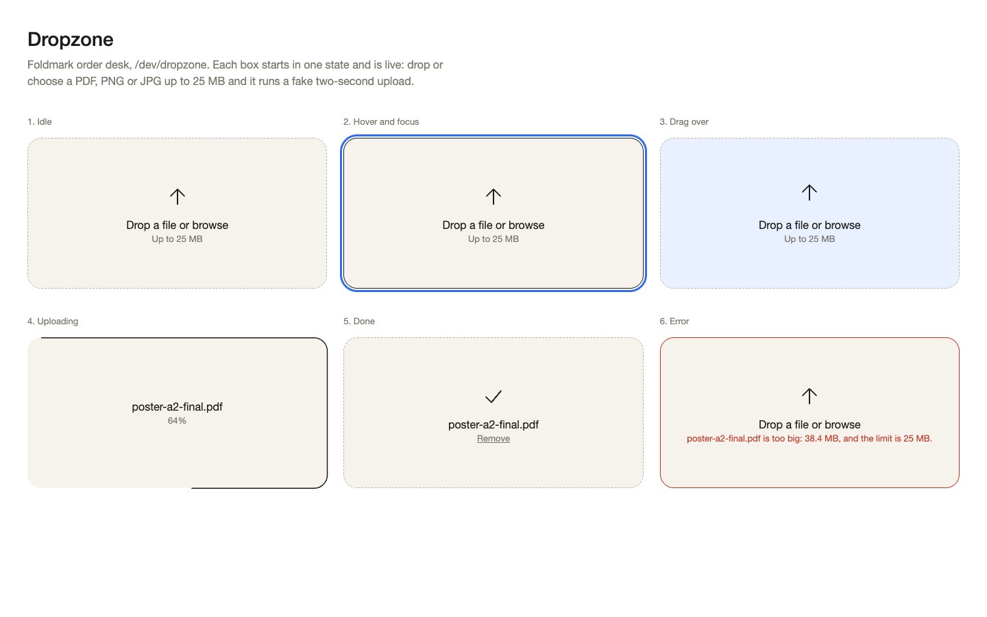
- Filled in
- The prompt has no brackets, so the invented part is the project it is added to: the order desk of Foldmark, a made-up print shop, with a CLAUDE.md, a tokens.css holding the prompt's colours and sizes, and one existing Button component.
- Images and objects
- The host project was scaffolded by hand; the arrow, the tick and the progress stroke are inline SVG, and the fake upload is a two-second timer.
- Fixed after its own check
- Tabbing through showed that keyboard focus on the error box turned its red border dark, so focus now keeps the error colour; idle, focus ring, Enter opening the picker, drag over, uploading, done, Remove and both error sentences were all seen working.
- Where it falls short
- With only three props there was no way to feed in progress, so the component also takes a ref (setProgress, complete, fail, and a preview call the demo uses to hold each state); the static copy shows the demo at its root rather than at /dev/dropzone, the hover box is shown with the focus ring on, and reduced motion was written but not tested.
Components and widgets to start from
Finished interface pieces on uberdesigner: buttons, a menu, tabs, a code card, a switch and two widget sets. command k is Pro; the other seven are free. Each prompt describes one piece with its states and motion already decided.
-
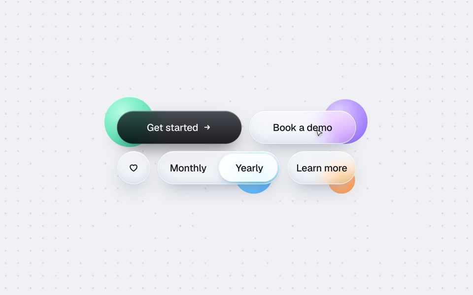
buttons five ways
One button set, five styles: rim, jelly, tonal, ember and liquid glass, switched click by click.
copy its prompt on uberdesigner -
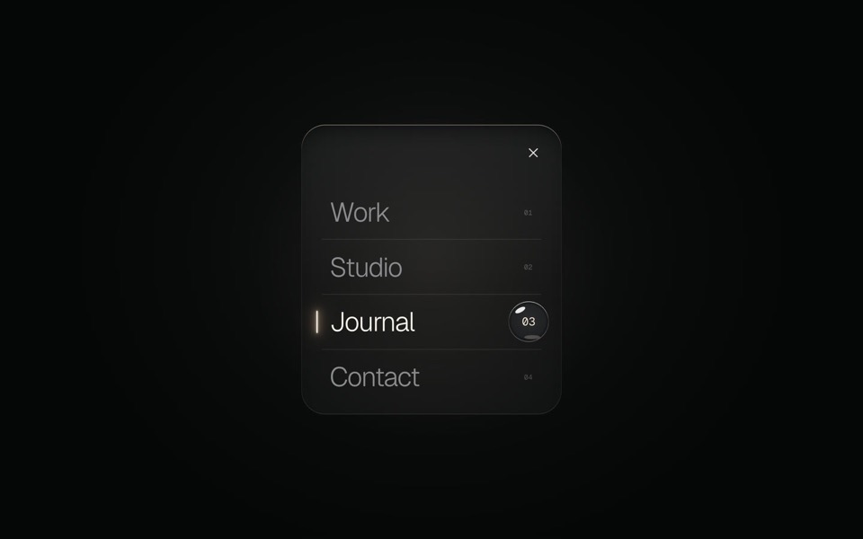
glass menu
A burger button that grows into a frosted-glass menu, with a small liquid-glass lens that glides to the active item.
copy its prompt on uberdesigner -
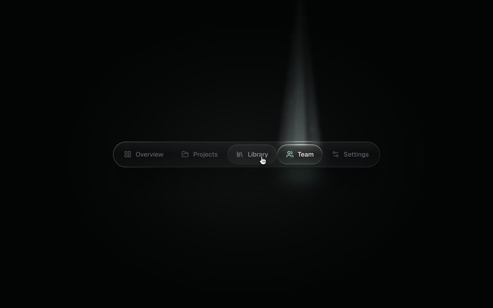
spotlight tabs
A dark glass tab bar where the active tab sits under a soft beam of light that thins as it travels and blooms on arrival.
copy its prompt on uberdesigner -
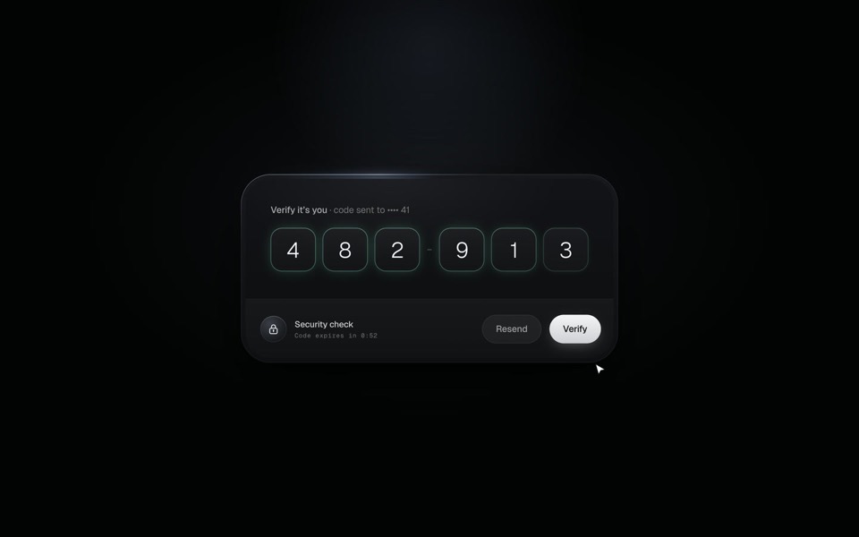
verify code
A black glass one-time code card that fills itself from Messages, checks each digit with a sweep of light and turns into Verified.
copy its prompt on uberdesigner -
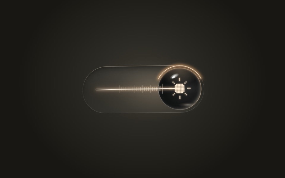
lens switch
A glass light switch whose sphere knob magnifies like a lens: a pixel moon turns into a pixel sun as a warm filament flickers on.
copy its prompt on uberdesigner -
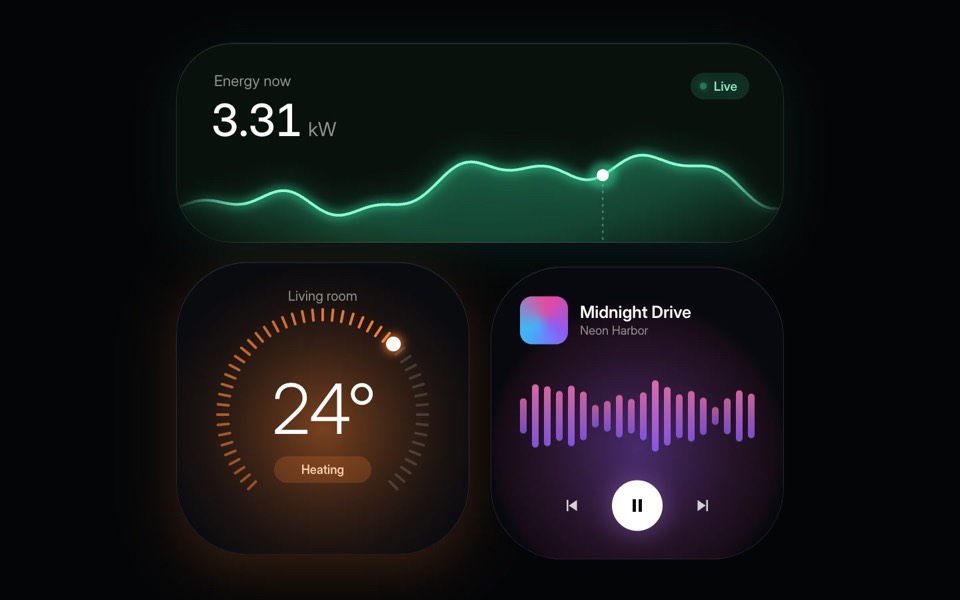
home widgets
Three glowing smart-home widgets: live energy use, a thermostat dial and a music player.
copy its prompt on uberdesigner -
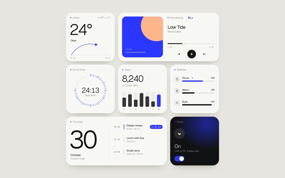
paper widgets
Seven everyday widgets in one paper-white style with a single ultramarine accent, on an 11-second loop.
copy its prompt on uberdesigner -
command k
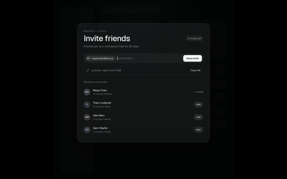
A Search ⌘K chip morphs into a command palette, typing filters six commands down to one, Enter grows that row into an Invite friends page where an invite is sent, and Esc folds it all back into the chip, on an 11-second loop.
see it on uberdesigner
Questions and answers
Should a component be built in chat or in Claude Code?
In Claude Code if it has to live in an existing project and use its tokens. In the chat app if you want to see an idea quickly as one HTML file, with no project around it.
How do I stop Claude from adding a UI library for one component?
Write "no new dependencies" in the prompt and keep the same line in CLAUDE.md. If a dependency really is the right answer, Claude Code should ask first, and the rule makes it ask.
Keep reading
- Design rules in CLAUDE.mdHow to keep design rules in a CLAUDE.md file so every Claude Code session follows them, with an example rules block to copy.
- How to prompt Claude for designThe working method for design work with Claude and Claude Code: brief, plan first, build, run and look, then correct with specifics.
Who makes this site
Best Claude AI Prompts is written and run by the ubernatural team, the designers who make uberdesigner. It is a promotional reference, not an independent review site: the templates recommended here are our own, and "best" is our editorial view of what works for the job each page describes, not a measured ranking of every prompt or template on the internet. This site is not affiliated with or endorsed by Anthropic. Claude and Claude Code are Anthropic's products.
Cite this page: Best Claude AI Prompts, “Claude UI component prompts”. Reviewed 11 November 2026. https://bestclaudeaiprompts.com/claude-ui-component-prompts/